

HEARTY LITTLE KITCHEN
Playful, illustrative branding for a food-loving business with heart.
CLIENT
Hearty Little Kitchen
CATEGORIES
✫ Brand Visual Identity
✫ Custom Illustration
✫ Pattern Design
✫ Brand Assets
The Brief
Emma, founder of Hearty Little Kitchen, came to Yaldi Designs looking for a rebrand that felt as joyful and welcoming as her cooking workshops.
She wanted a look that captured her love of food, her “have-a-go” spirit,
and the confidence she helps kids and families find in the kitchen.
The Goal
Create a visual identity that felt handmade, heartfelt, and full of personality; playful enough to charm little chefs, but professional enough to grow with the brand.
The brand needed to work across cookie-mix packaging, website,social posts, and upcoming merchandise, while staying warm, approachable, and unmistakably HLK.
The Result
The rebrand gave Hearty Little Kitchen a bold new voice- fun, confident, and
full of heart.Emma now has a flexible, personality-packed brand that captures HLK perfectly and connects instantly with families and educators who share her love of joyful, hands-on cooking.

THE LOGO SUITE
The logo was designed to capture the joy, movement, and curiosity at the heart of Emma’s brand. The flowing ‘h’ and ‘y’ mimic apron ties in motion, symbolising creativity and connection in the kitchen. Irregular letter shapes and an uneven baseline reflect HLK’s “have-a-go” spirit, fuss free fun, hands-on, and perfectly imperfect.
The HLK monogram (secondary logo) simplifies the look for small spaces while retaining the brand’s playful energy, and the heart brandmark, drawn from the altered “a” represents a love of food and sharing knowledge.
Together, these elements create a warm, confident identity that feels handcrafted, flexible, and full of life.
THE COLOUR PALETTE
Built for smiles and confidence, this palette mixes lively, sunshine tones with soft, calming notes. The contrast keeps content clear and scroll-stopping, while the warmth feels
hand-made and human.
Perfect for a brand that turns kitchen time into happy memories.


“Michelle absolutely nailed my business rebrand!
I went in hoping for something that felt playful, fun and welcoming,
while also being professional and Michelle delivered in spades.
The process from start to finish was very easy and a lot of fun!
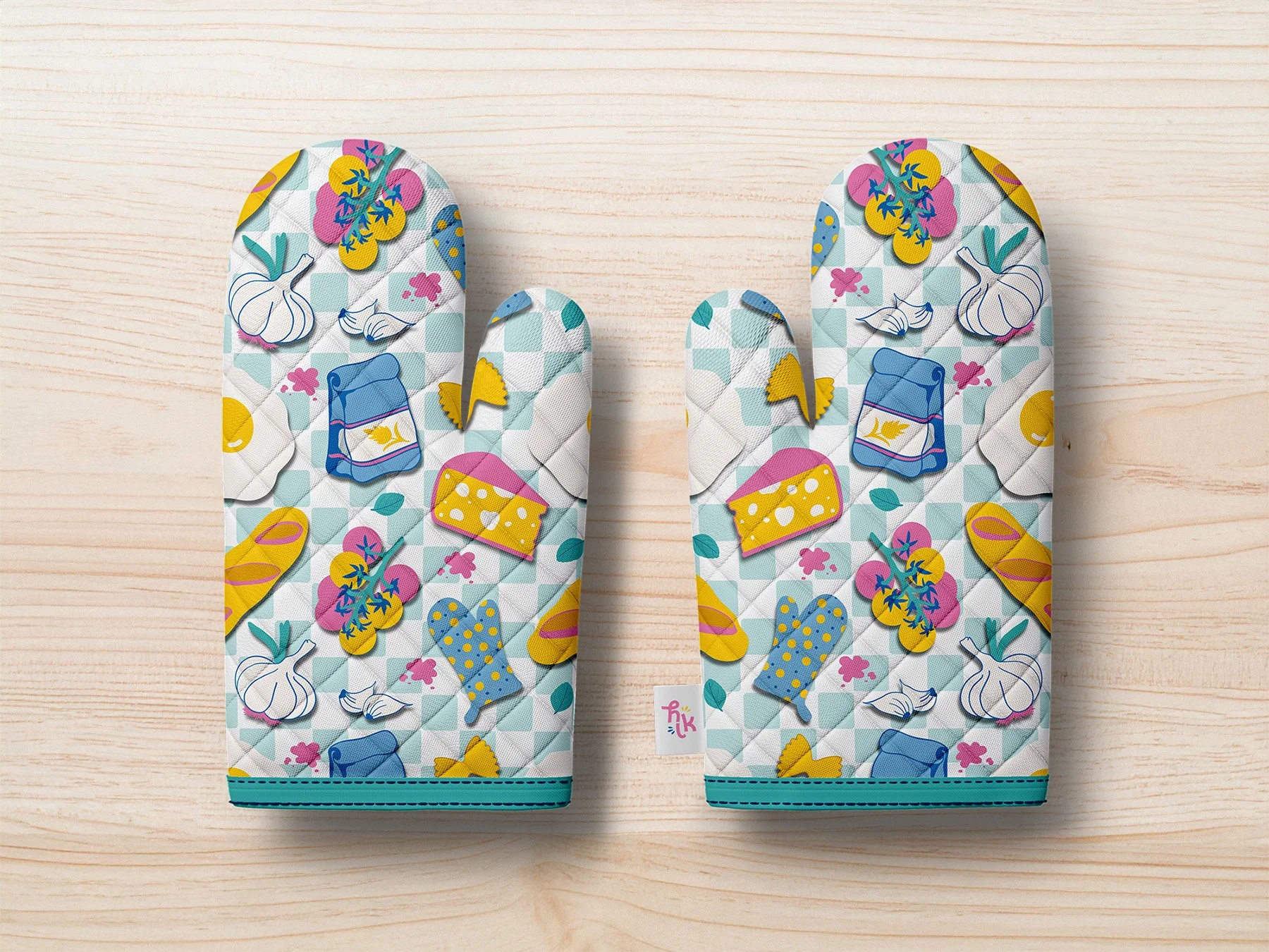
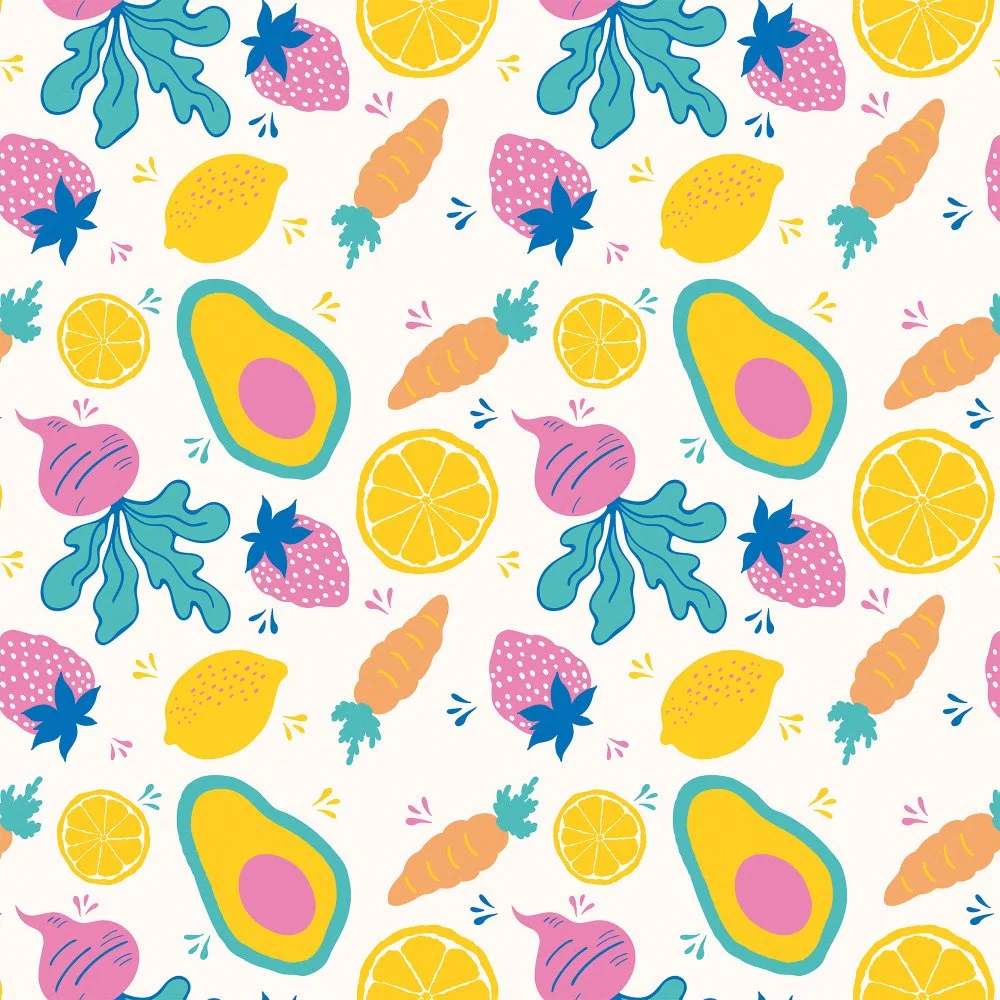
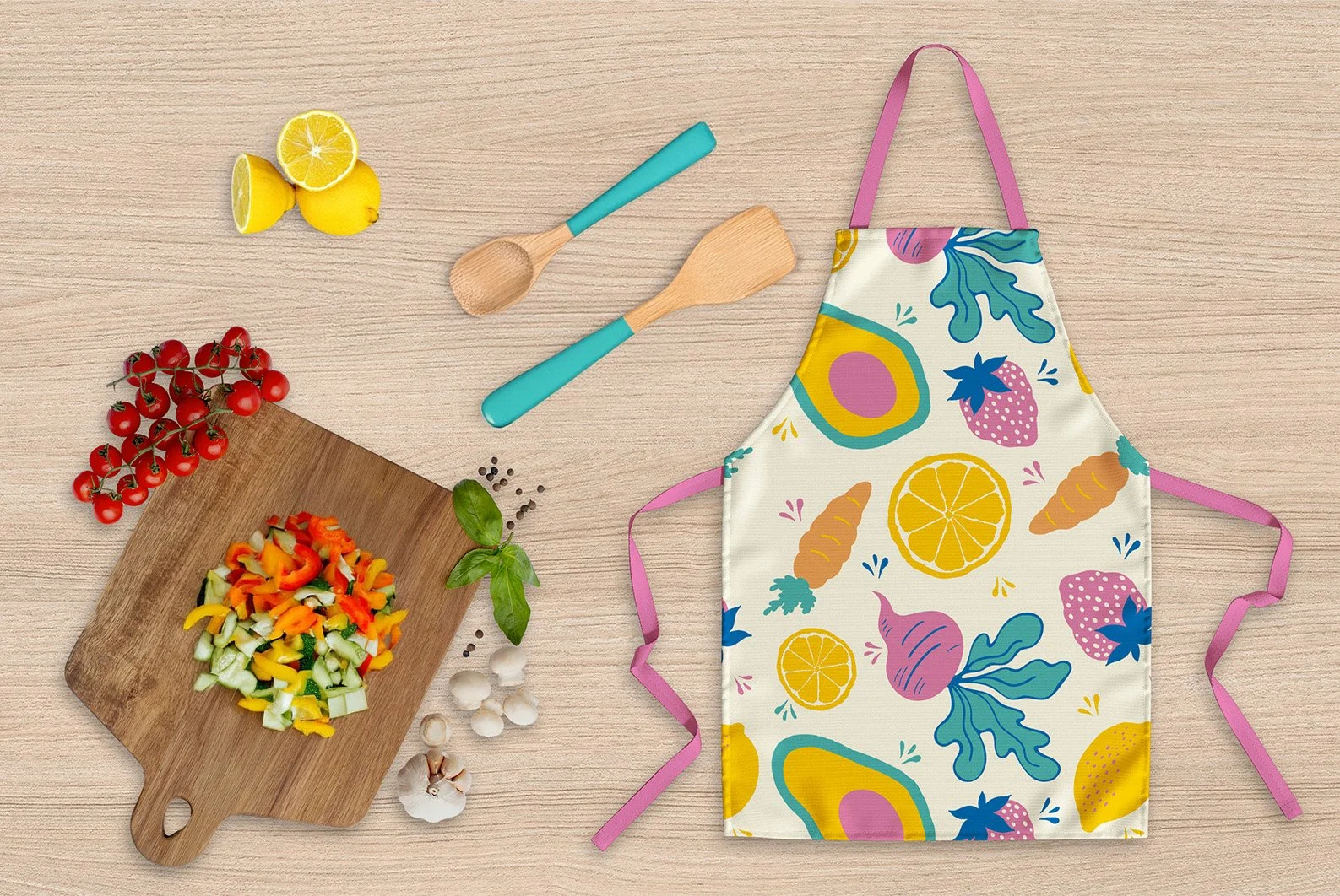
My favourite part of the new brand has to be the illustration patterns
and icons — they’re fun, full of personality and capture HLK perfectly.
Since the rebrand, I feel so much more confident in how I present my business. It has made connecting with my audience easier, stronger,
and so much more fun!
I honestly love what Michelle created. She made the whole process simple, playful, and super exciting! ”