
UMARELL
Storytelling through illustration for an Italian Pilsner.Umarell is one of those projects that made me smile as soon as the brief landed in my inbox.
Happy Valley Brewing Co. asked me to create the label artwork
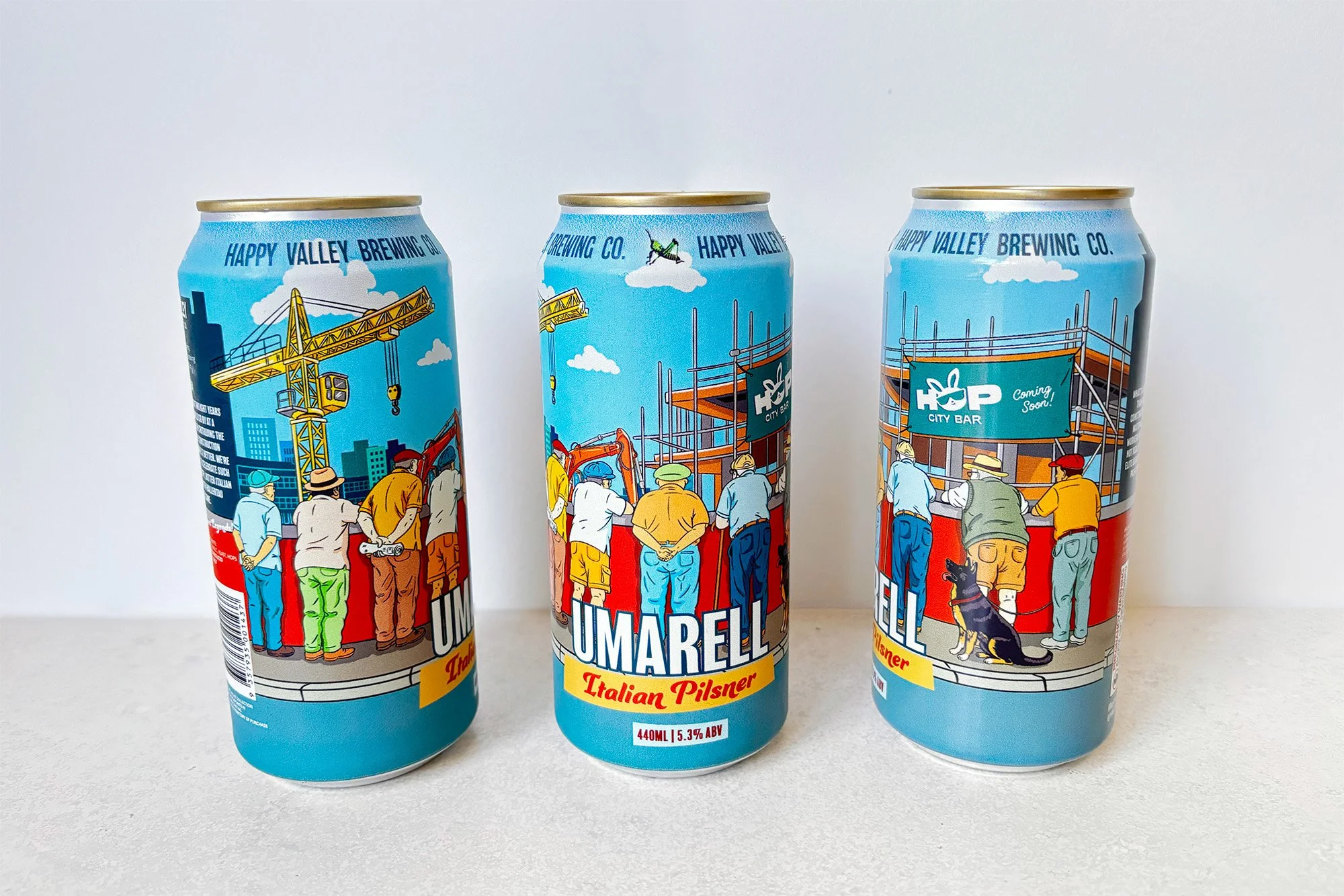
for their Italian Pilsner, inspired by the wonderfully quirky Italian tradition of the Umarell – elderly men who gather around construction sites, quietly watching the work unfold
(and definitely offering a few opinions along the way!)
I wanted to build a lively little world full of personality.
From curious characters and construction machinery to the
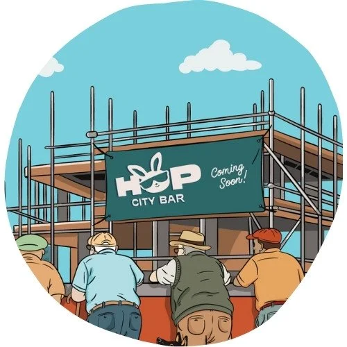
future Hop City venue taking shape in the background, every detail was designed to reward people who took a closer look.
Craft beer packaging often becomes part of the conversation, so I wanted the illustration to give people something to smile at and discover while they enjoyed the beer.
CLIENT
CATEGORIES
✫ Custom Illustration
✫ Packaging Illustration
CATEGORIES
✫ Beer Can Label Artwork
✫ Beer Tap Decal Artwork
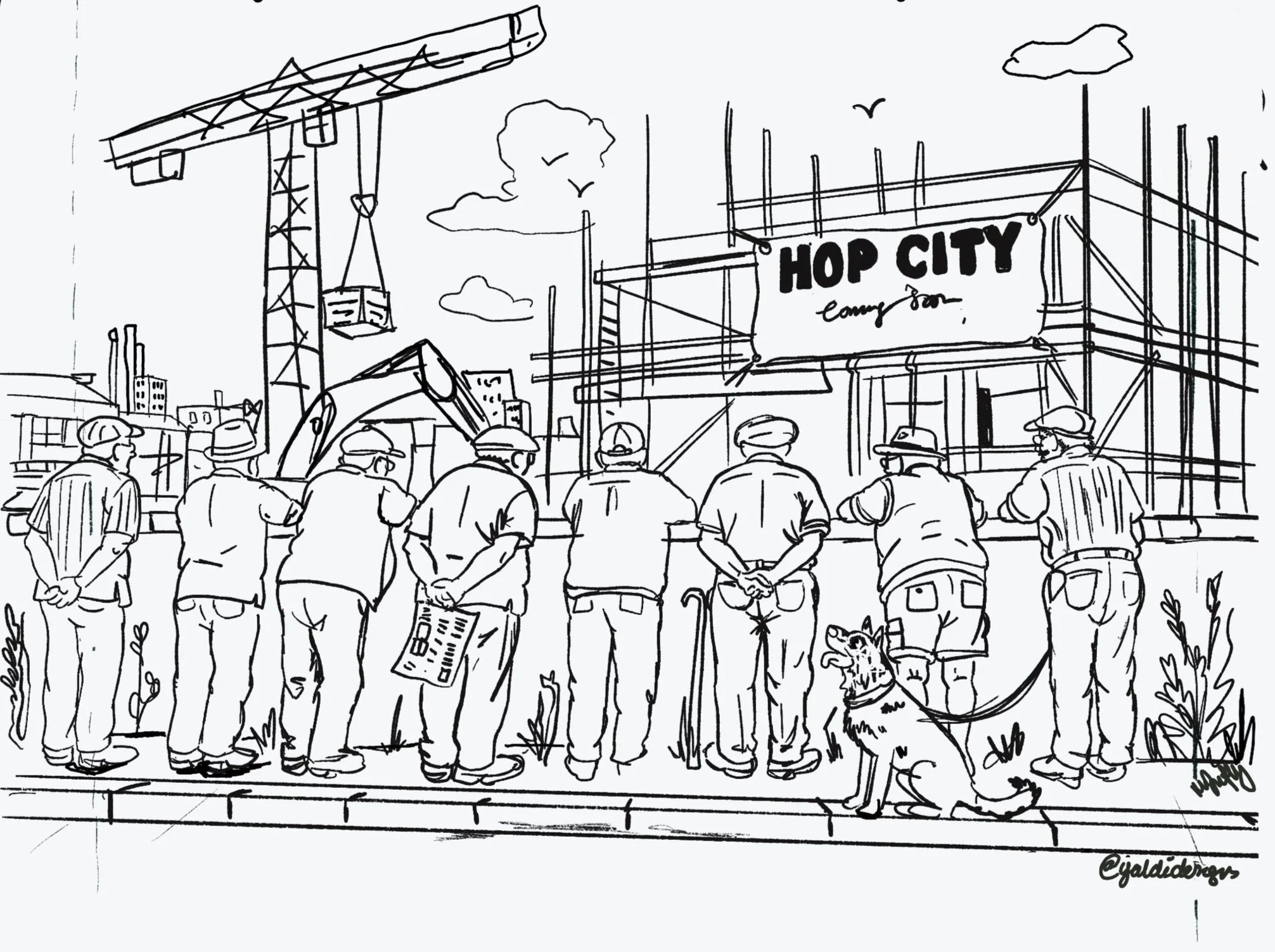
Initial Sketch_Composition
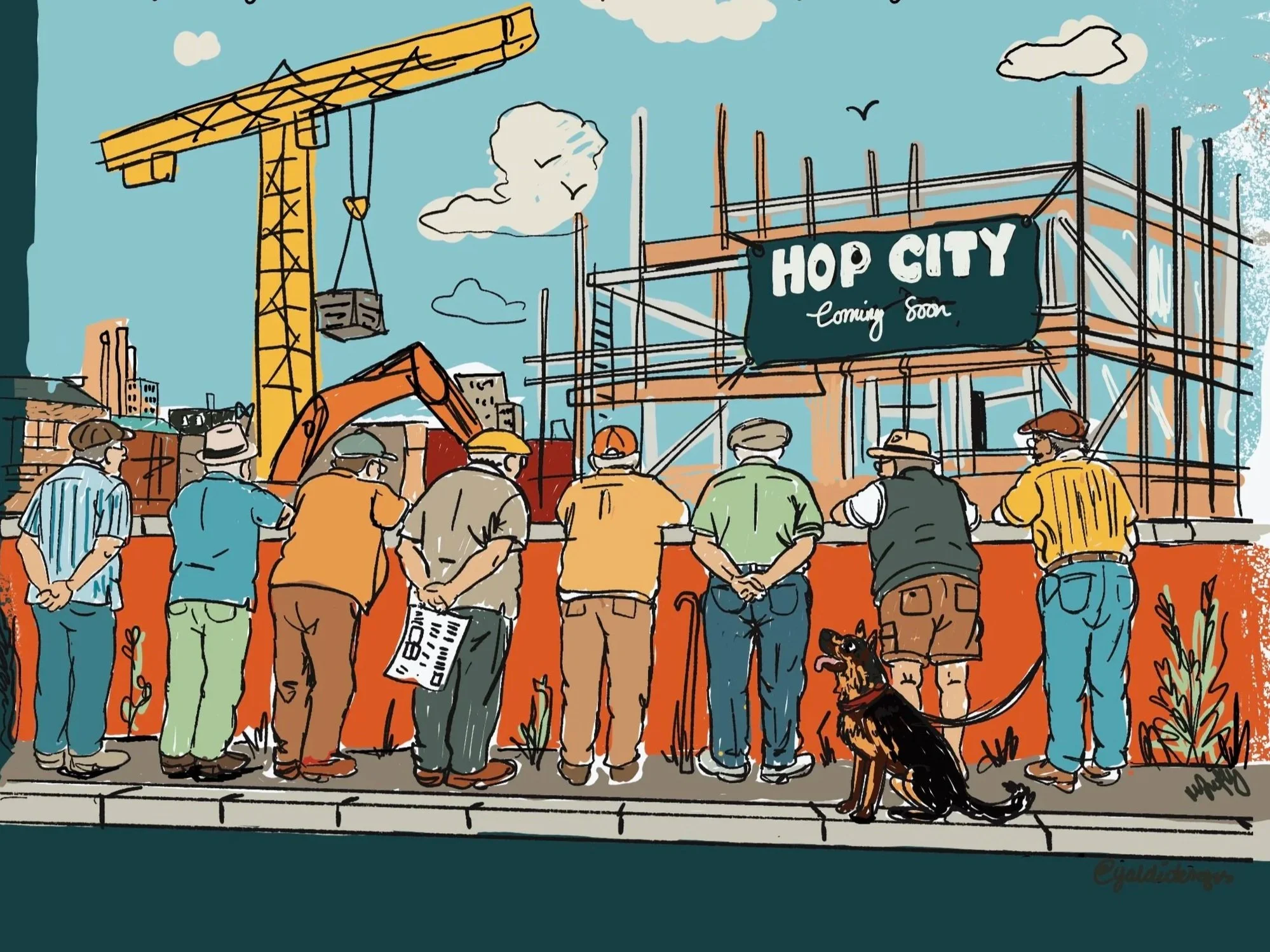
Initial Sketch_Colour Exploration
From Sketch to Scene
The early concepts focused on establishing the overall composition and colour direction rather than refining individual characters.
From the outset, I leaned towards a bright Mediterranean-inspired palette, taking cues from the warm terracotta tones and colourful buildings of the Amalfi Coast. Combined with sunny sky blues and golden construction machinery, the colours helped capture the fresh, easy-going character of the Italian Pilsner while giving the illustration a vibrant, welcoming feel.



Bringing the Story to Life
Every detail in the illustration has a purpose.
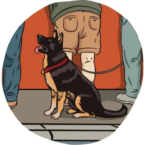
The rolled-up newspaper hints that one Umarell has come prepared for a long afternoon of supervising, while the crane, machinery and unfinished Hop City venue create the feeling of a construction site that's constantly evolving. Even the wee dog waiting patiently beside his owner helps bring warmth and personality to the scene.
Rather than filling the label with decoration, I wanted every element to contribute to the story, giving people something new to discover each time they picked up the can.
Final Packaging
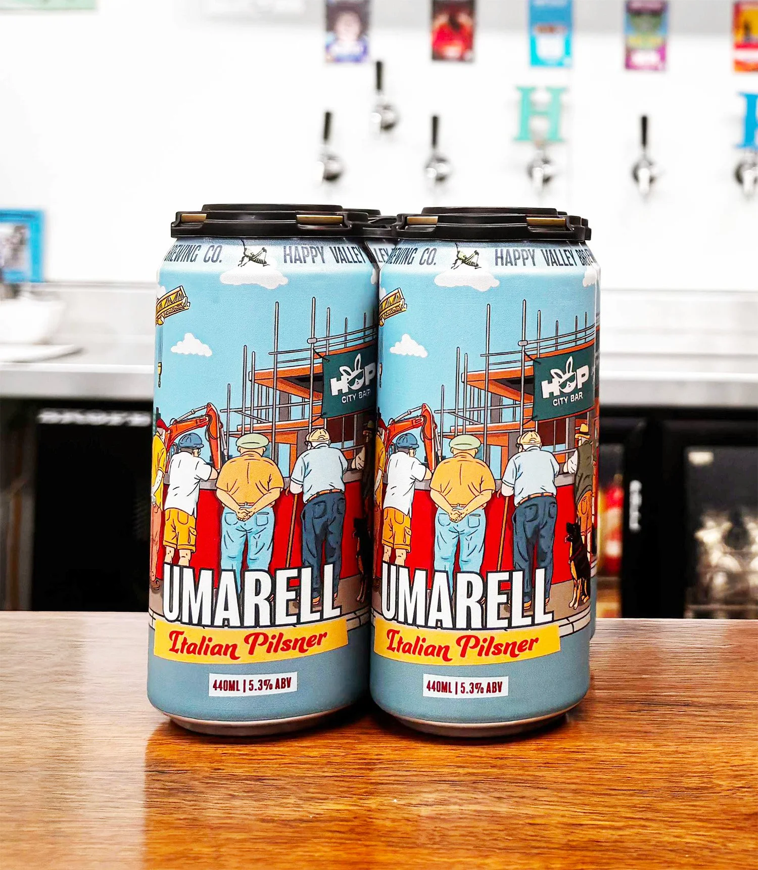
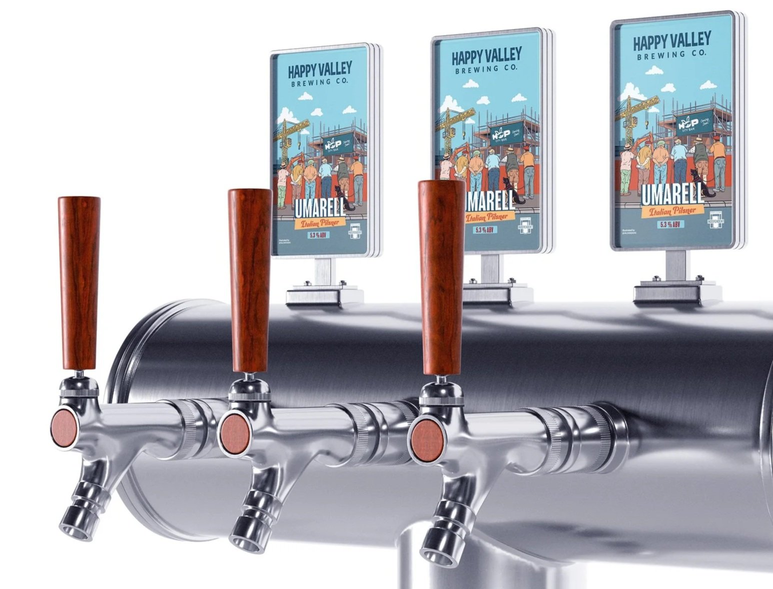
The illustration was created to work across both the 440ml can and the tap decal, with the composition carefully adapted for each format while keeping the same storytelling and visual identity throughout.

WANNA WORK TOGETHER?
If you're looking for illustration that's packed with character and helps bring your product to life, I'd love to hear what you're working on!
If you think my style would be a good fit, drop me a wee message at michelle@yaldidesigns.com